|
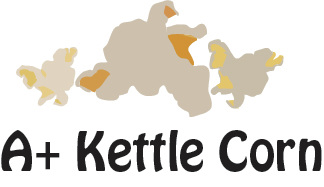
This is the final look I chose
|
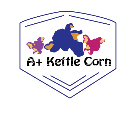
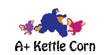
My idea came from seeing the modern logo designs on Google. They only used about 3-4 colors with basic font and formation so I decided to use that. I decided to use first plain colors like how normal kettle corn looks like then I used brighter colors that wouldn’t normally use on kettle corn like blue, purple, and pink but it looked kind of funny so used the normal looking colors. I think its good because it’s a modern logo design and it gives a clear idea what the product is with the name on it.
|
|
